LiquidX · 2024
GVRN
Designing the first dashboard UI kit for a Web3 legal stack—before there was a design system, a pattern, or a visual identity.
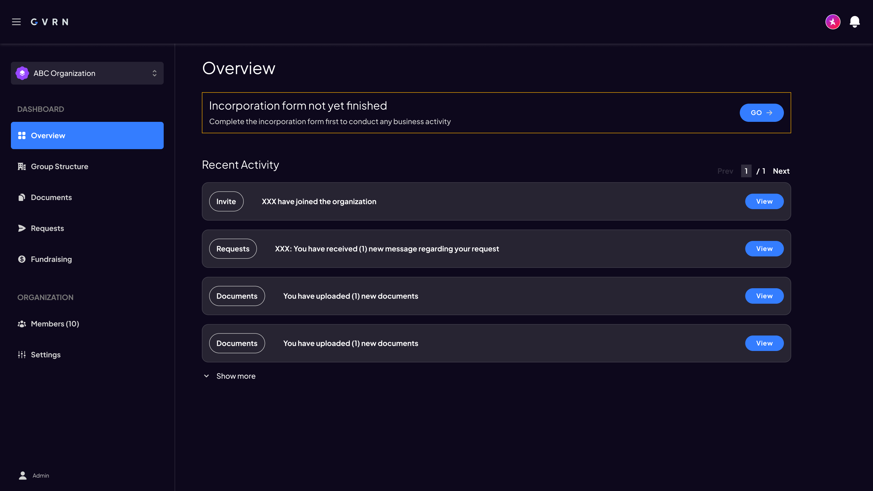
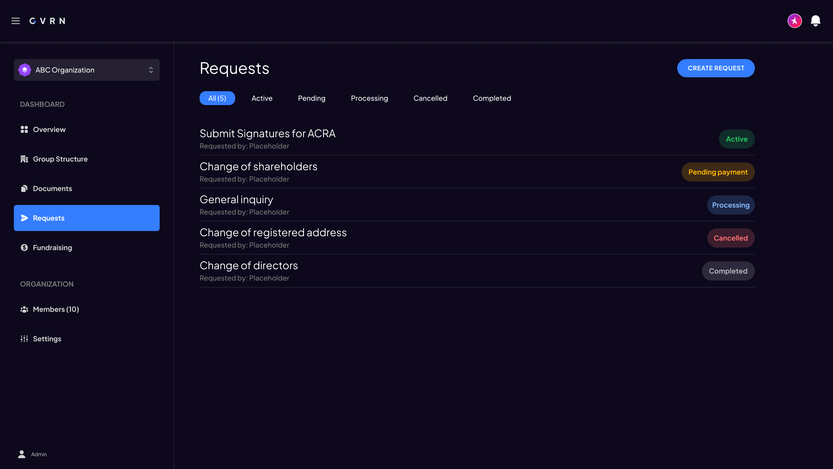
Early dashboard Overview from the Figma source. Live product at gvrn.ai (maintained separately since this work).
Founders incorporating a Web3 company face a unique problem: the legal and compliance workflows are built for traditional businesses, but the product needs to feel native to crypto. I was brought in to design the first dashboard for GVRN—before there was a design system, before there was a pattern, before the product had a visual identity.
GVRN needed a dashboard for founders to manage entity setup, fundraising, and compliance for AI and Web3 companies. I designed the initial UI kit—layout, navigation, and a minimal component set—that the team built the first product surface from. The kit stayed small on purpose, giving later releases a single visual source to extend rather than reinvent.
| Role: UX/UI Designer | Timeline: ~3 months · Q1 2024 |
| Team: 2-person build: 1 engineer + myself (design + Figma source) | Tools: Figma, Retool |
| Company: LiquidX | Impact: Adopted as visual source · ~20 screens designed & handed off in ~3 months |
I owned the visual source for the first dashboard: establishing a minimal UI kit in Figma, setting the responsive structure, and sharing the file so design and Retool build looked at one kit. I collaborated with the founding product team as requirements shifted weekly.
GVRN is the product founders use to incorporate an AI, Web3, crypto, or blockchain company, and to handle the legal and operational work around that—entity setup, fundraising, compliance. It is live at gvrn.ai.
The founders needed a place to see incorporation status, manage documents and requests, and eventually run fundraising—without the UI feeling like a generic enterprise SaaS bolted onto crypto. Early objectives covered founder and investor fundraising workflows, including equity/token visibility and wallet autonomy.
A full design system would have been premature. The product was pre-launch, the team was small, and the requirements were shifting weekly. I made a deliberate choice: build enough to establish consistency—type, colour, layout, navigation, and a short set of components—and nothing more. The kit had to be extensible without being overbuilt.
That meant resisting the urge to design every edge state up front. Placeholder icons stayed on secondary nav items. Empty states and role variants (Admin, Member, Shareholder) came as the flows matured. Consistency first; completeness later.
I organised the dashboard around the founder’s work, not the org chart of the product. Sidebar sections split Dashboard (Overview, Group Structure, Documents, Requests, Fundraising) from Organization (Members, Settings), with an org switcher at the top for multi-entity work.
I kept the colour palette minimal—one primary blue accent, dark neutrals, and semantic status colours—because the product’s trust signals come from the legal compliance layer, not the UI. A loud dashboard would undermine the sense of security founders need when filing directors, signatures, and incorporation documents.
Status badges earned more variants than almost anything else: Active, Pending payment, Processing, Cancelled, Completed, plus colour tokens (green / yellow / blue / red / grey). In a compliance product, state is the interface. Tables and filter chips followed the same logic—dense, scannable, and Retool-friendly.
For Requests, I tried a compact list layout first—title, status badge, requester. It looked clean, but it did not scale once actions and columns appeared. I moved to a data table with filters, unread markers, and explicit View / Cancel actions. The list version stayed in the file as the older option; the table became the working pattern for Documents and Requests alike.
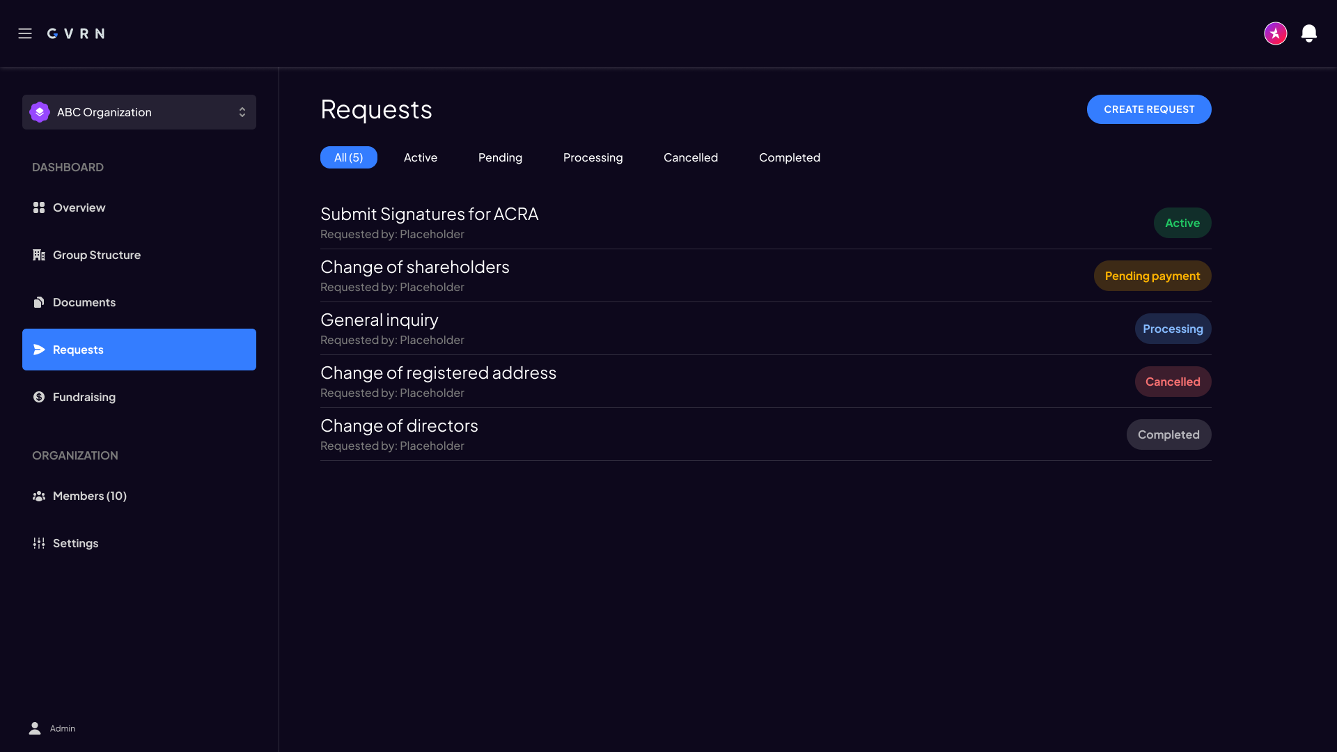
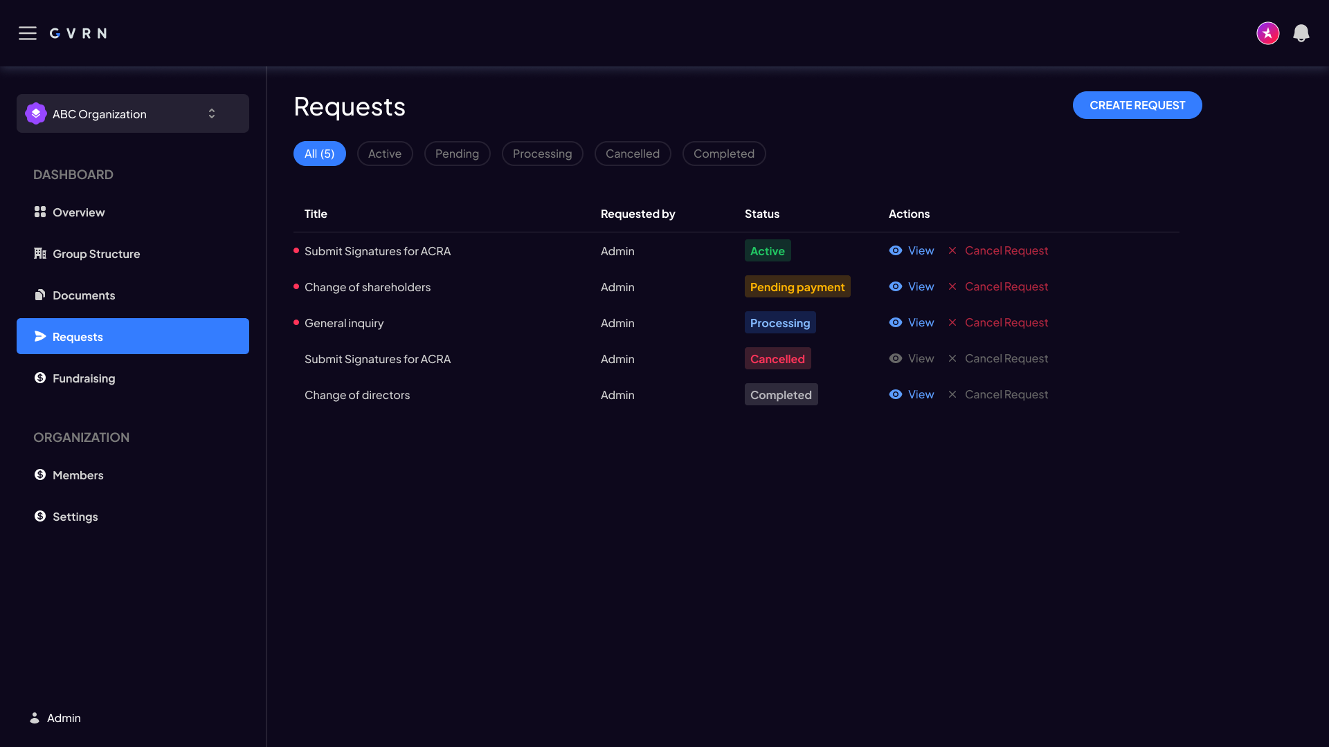
Retool was the build surface next to the Figma file. I did not design decorative one-offs that could not map to Retool’s table, form, and navigation primitives. Sidebar + content, filter chips, status badges, and data tables were chosen because they translated: the kit constrained what we would invent in Figma so engineering could assemble screens without waiting on pixel-perfect custom widgets.
The handoff was the file itself—components, layout, and how to use them in one place. Design and build looked at the same source.
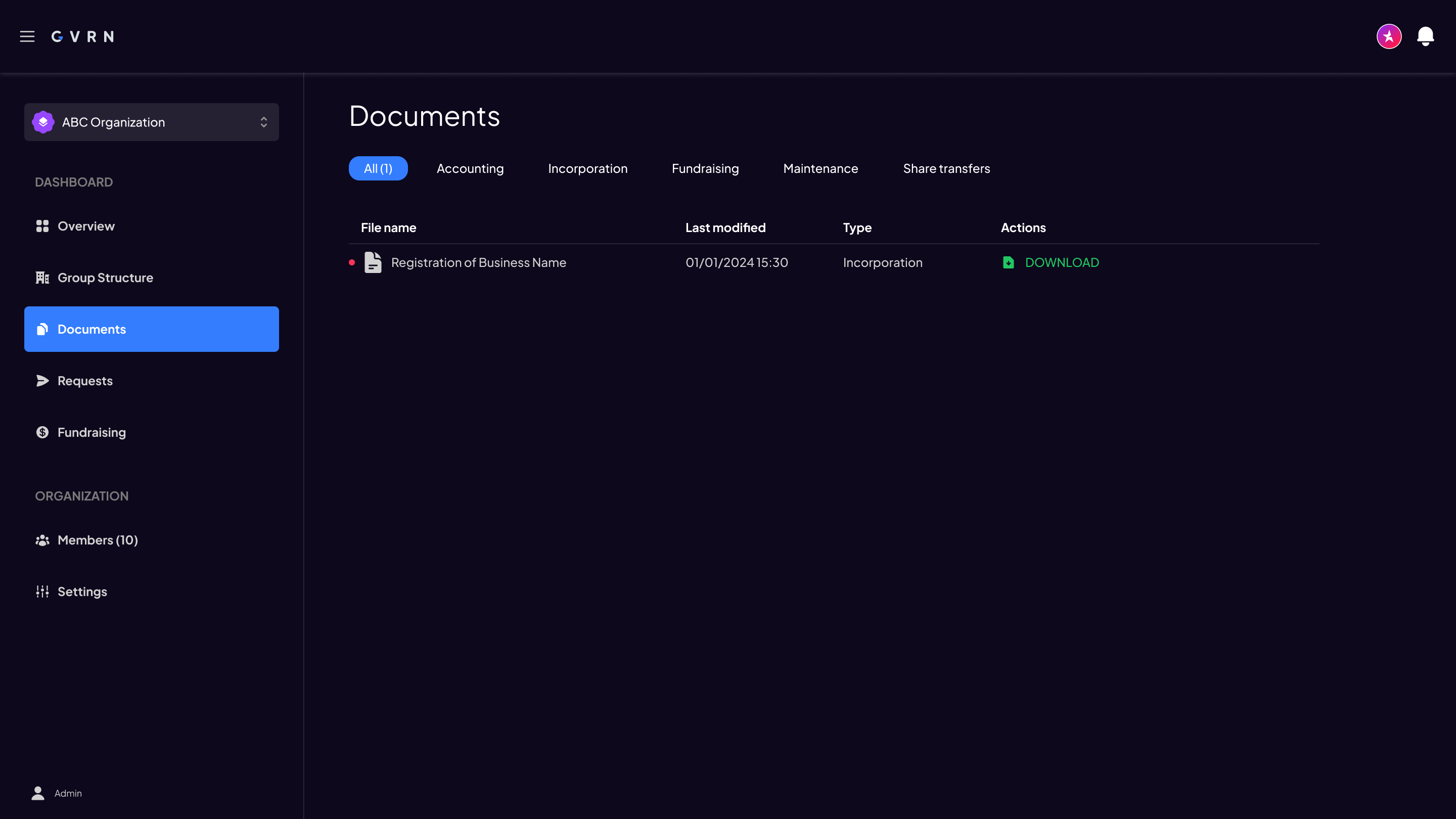
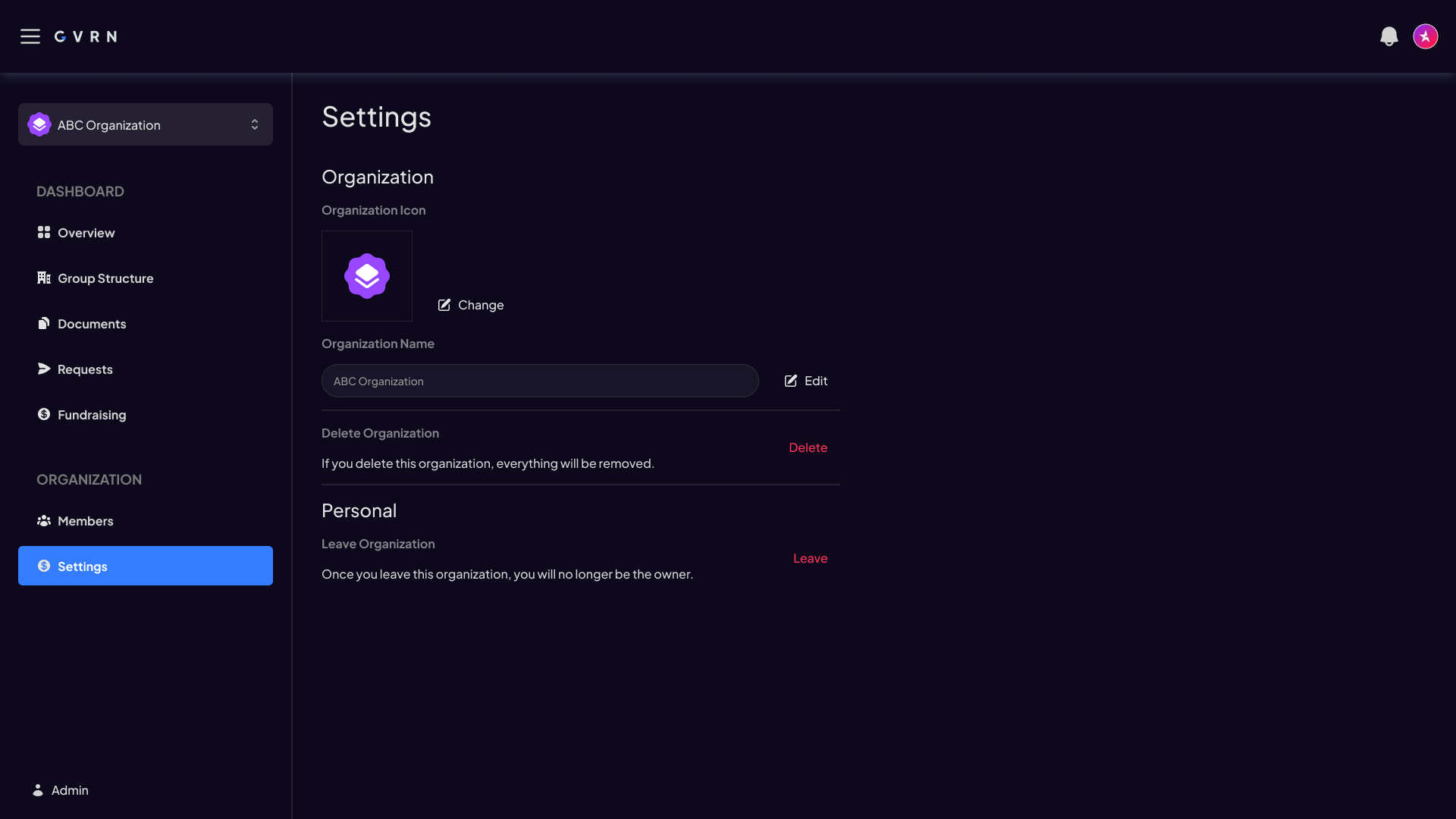
What I produced was a minimal UI kit in Figma and the early dashboard screens assembled from it: Overview with incorporation status and activity, Documents, Requests, Settings, and fundraising create flows. Local components included Button, Input, Navbar, sidebar, Tab, filter, and a family of Status variants.

Foundations and components—small on purpose.
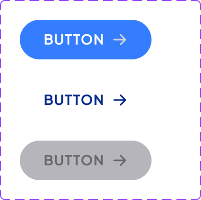
Button component set from the Figma kit.
{
  "color": {
    "bg": { "value": "#0A0915" },
    "surface": { "value": "#141225" },
    "primary": { "value": "#2E7DFF" },
    "text": { "value": "#FFFFFF" },
    "muted": { "value": "#9CA3AF" },
    "success": { "value": "#22C55E" },
    "warning": { "value": "#EAB308" },
    "danger": { "value": "#EF4444" },
    "neutral": { "value": "#6B7280" }
  },
  "spacing": {
    "xs": { "value": "4px" },
    "sm": { "value": "8px" },
    "md": { "value": "16px" },
    "lg": { "value": "24px" },
    "xl": { "value": "32px" }
  },
  "type": {
    "heading": { "value": "28px/600" },
    "body": { "value": "14px/400" },
    "meta": { "value": "12px/400" }
  }
}
Token values reconstructed from the early kit visuals for handoff clarity—not a shipped tokens pipeline.
The kit gave the team a shared visual language. New screens could be assembled from existing patterns instead of redesigned from scratch. The Figma file remained the single source for subsequent early screens; the live product at gvrn.ai has since moved on under separate ownership of the experience.
If I did this again, I would have documented the kit’s usage guidelines more formally. The components were self-explanatory to me, but a new designer joining the team would have needed more context—when to use the list row versus the data table, which status colours map to which legal states, how far Retool was allowed to diverge. The lesson: a design system is only as strong as its documentation, even when the kit is deliberately small.
'%3e%3cstop%20offset='0'%20stop-color='%23E07A5F'/%3e%3cstop%20offset='1'%20stop-color='%23B84A2E'/%3e%3c/linearGradient%3e%3c/defs%3e%3cg%3e%3c!--%20Bottom%20wing%20--%3e%3cpath%20fill='url(%23wing-bottom)'%20d='M417.58,760.351c0,-0%20-0.483,290.863%20-0.746,449.566c-0.045,26.601%2010.512,52.123%2029.333,70.921c18.822,18.798%2044.358,29.322%2070.959,29.245c195.963,-0.603%20619.277,-1.867%20724.362,-1.867c3.826,-0%207.181,-2.745%208.202,-6.71c1.022,-3.965%20-0.543,-8.175%20-3.823,-10.292c-143.543,-92.615%20-828.287,-530.863%20-828.287,-530.863Z'/%3e%3c!--%20Top%20wing%20--%3e%3cpath%20fill='url(%23wing-top)'%20d='M417.58,883.378c0,-0%20-0.483,-290.863%20-0.746,-449.566c-0.045,-26.601%2010.512,-52.124%2029.333,-70.922c18.822,-18.798%2044.358,-29.322%2070.959,-29.244c195.963,0.603%20619.277,1.867%20724.362,1.867c3.826,-0%207.181,2.745%208.202,6.71c1.022,3.964%20-0.543,8.175%20-3.823,10.291c-143.543,92.616%20-828.287,530.864%20-828.287,530.864Z'/%3e%3c!--%20Center%20mark%20--%3e%3cpath%20fill='url(%23center)'%20d='M736.057,846.967c-4.439,-3.121%20-7.08,-8.207%20-7.08,-13.634c-0,-5.426%202.641,-10.512%207.08,-13.633c81.272,-57.145%20394.563,-277.428%20487.69,-342.908c5.089,-3.578%2011.747,-4.024%2017.268,-1.157c5.52,2.867%208.985,8.57%208.985,14.791c-0,122.907%20-0,562.908%20-0,685.814c-0,6.221%20-3.465,11.924%20-8.985,14.791c-5.521,2.868%20-12.179,2.421%20-17.268,-1.157c-93.127,-65.48%20-406.418,-285.763%20-487.69,-342.907Z'/%3e%3c/g%3e%3c/svg%3e)
张菱真 © 2020-2026
经过无数设计更改、与bug交战、修改句子等挫折后完成
