AirFitness
健身房预约应用的产品设计。
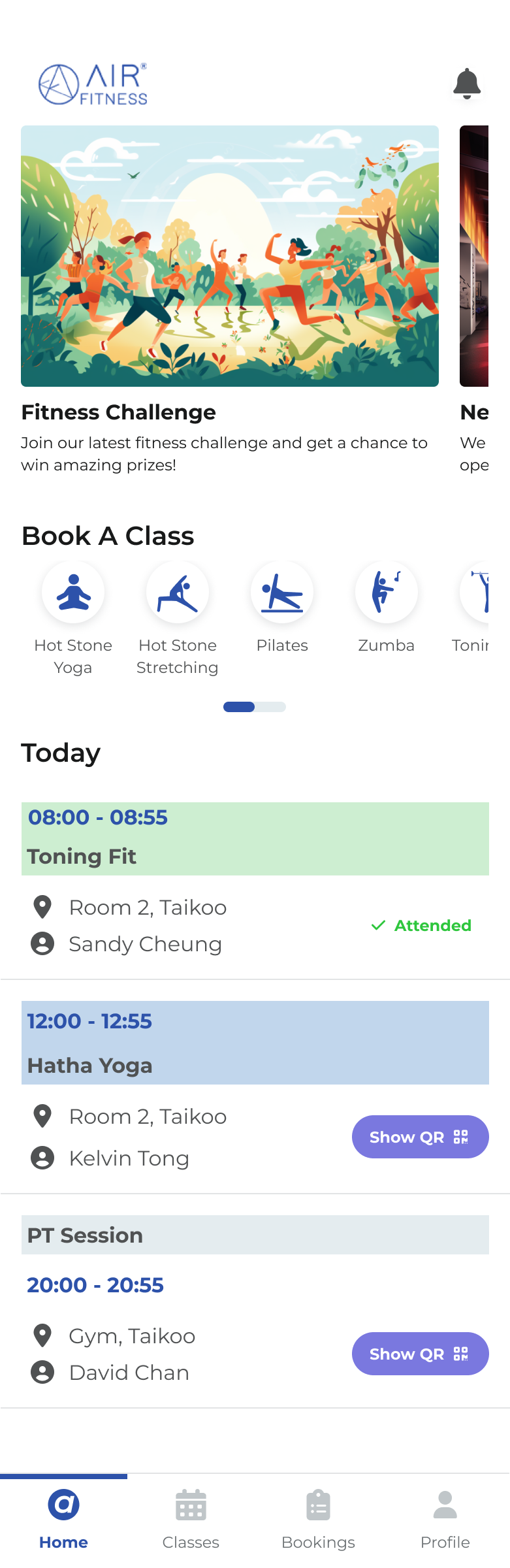
The product, as designed: pick a brand, see today, book the next class.
| Company/Role: Freelance Project — Designer & App Developer | Target Platform: Mobile (iOS & Android) |
| Team Size: Solo product design and mobile app frontend development | Tools: Figma, React Expo |
| Project Length: 3 months | Techniques: Persona, information architecture, booking state machine, UI design, component library |
AirFitness is the member-facing app for a fitness group that runs more than one brand under one roof — airstudio for boutique classes and airfitness for the gym floor. Members join a branch, hold a contract, and book into timetabled classes: hot stone yoga, pilates, zumba, toning fit, super core.
The operational side of that already worked. Staff had a schedule, a membership database and a front desk. What members had was a timetable they had to translate — is this class full, have I already booked it, can I still cancel, did last week's session actually count? Each of those questions has a definite answer sitting in the system, and none of them were being answered on a screen.
The result is the failure mode every gym knows: members book and then don't turn up. A no-show is not usually a change of heart. It is a class that slipped past someone who meant to be there, or a full class whose waitlist never moved because the person holding the slot forgot to release it.
How might we make attending the next class the easiest thing a member can do on their phone?
I owned the product end to end as the product designer — from who it is for, to the rules it keeps, to the screens that enforce them:
- Defining the member the app is for, and holding every later decision to that definition.
- Mapping the booking lifecycle as a state machine so design and engineering agreed on one set of rules.
- Restructuring the information architecture across three versions until the tabs matched member intent.
- Designing the UI and component library the screens are assembled from — one class card, one valid action.
Version 3.0 settled on four tabs. Not a map of the gym's database objects — four jobs a member actually has.
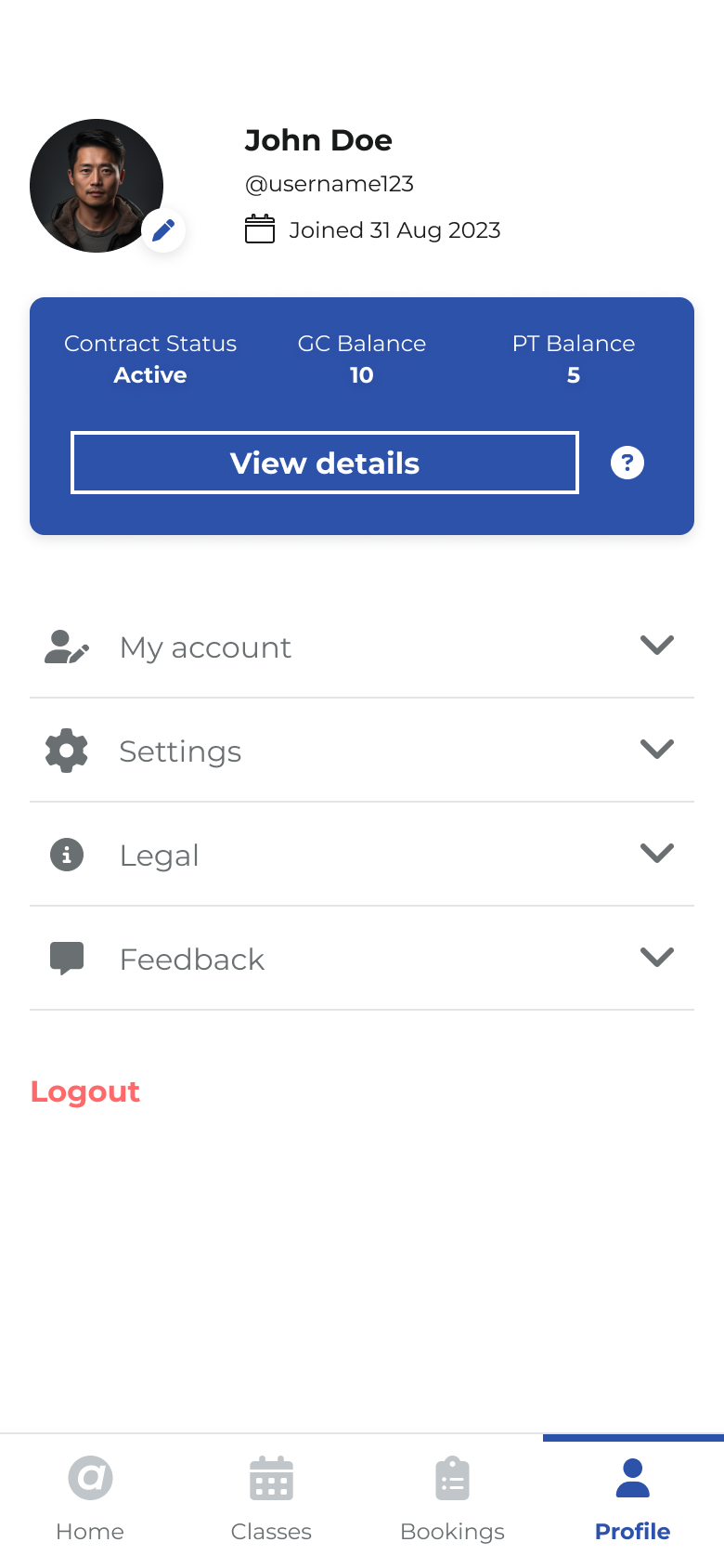
Home, Classes, Bookings, Profile. Each tab answers one question: what is today, what can I book, what have I committed to, who am I here.
- Home — today at a glance: class shortcuts, news, and the sessions already on the member's day, with Show QR when it is time to walk in.
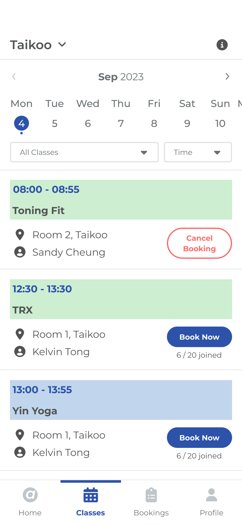
- Classes — the live timetable, filtered by date, class type and time. The card itself is the booking control.
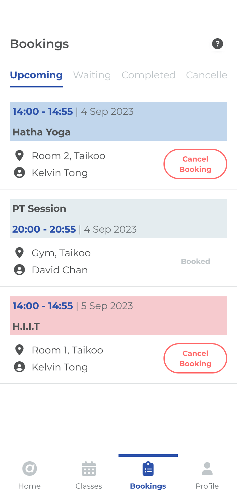
- Bookings — upcoming, waiting, completed, cancelled. The place to manage a commitment, not to discover a class.
- Profile — contract, class credits, account, settings, legal. Everything about the member, none of the timetable.
The persona work landed on someone specific rather than a demographic bracket. David, 32, works long hours in a demanding desk job. He values fitness and wants to keep an active lifestyle in spite of his schedule — he is not unmotivated, he is squeezed. He is fluent with his phone and impatient with apps that make him hunt.
- Stay fit and healthy, and improve energy levels
- Manage stress
- Find a convenient way to stay consistent and attend classes regularly
- Finds it hard to attend consistently
- Needs an easy way to fit class timings into a daily routine
- Variety of classes at different times throughout the day
- Reminders that help plan the day and avoid missing classes
- Clear communication, easy navigation, an easy-to-use interface
- Motivated by progress tracking
Two lines of that persona did most of the work later on. “Reminders to help plan the day and avoid missing classes” is why notifications are a first-class surface — a bell on Home, not a settings toggle. And “variety of classes at different times” is why the timetable is filtered, not scrolled.
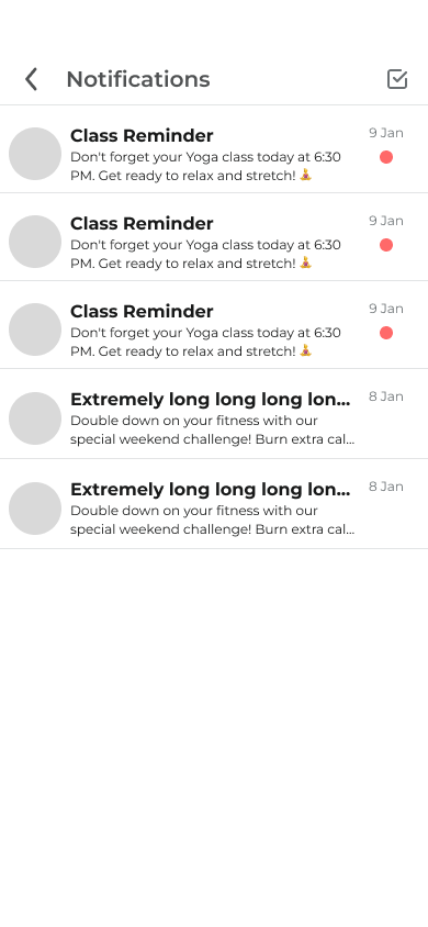
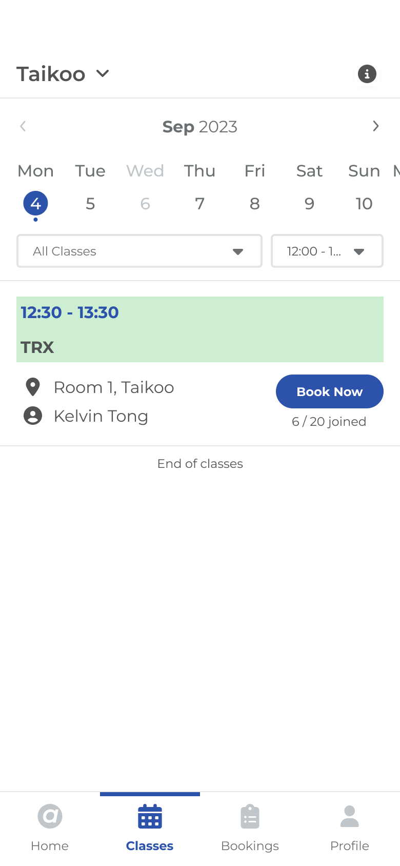
The two persona requests, as screens: a reminder that reaches him, and a timetable that can be cut down to the hour he actually has.
Before drawing a single screen I mapped booking as a state machine. A booking is never just “made” or “not made”; it moves through waiting, booked, cancellable, checked-in, attended and expired, and the state alone decides what the member is allowed to do next.
Writing the rules down first meant the interface could make a promise it kept everywhere: one class card, one primary action, always the right one. The member is never offered a button that will fail.
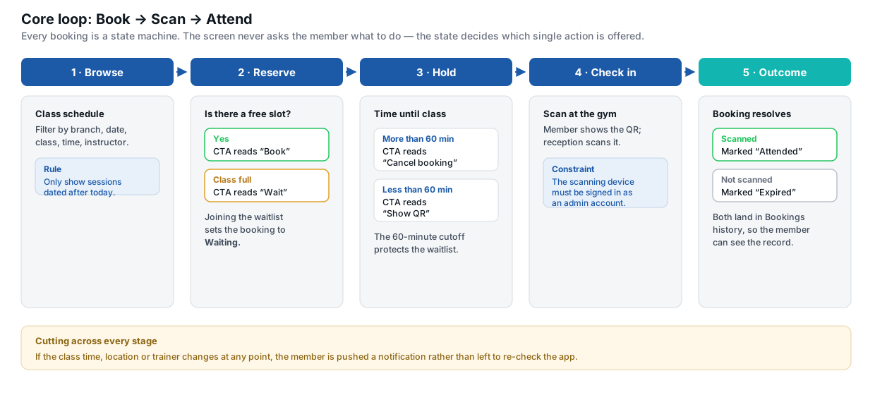
Book → Scan → Attend. The rules that govern each transition, mapped before any UI existed.
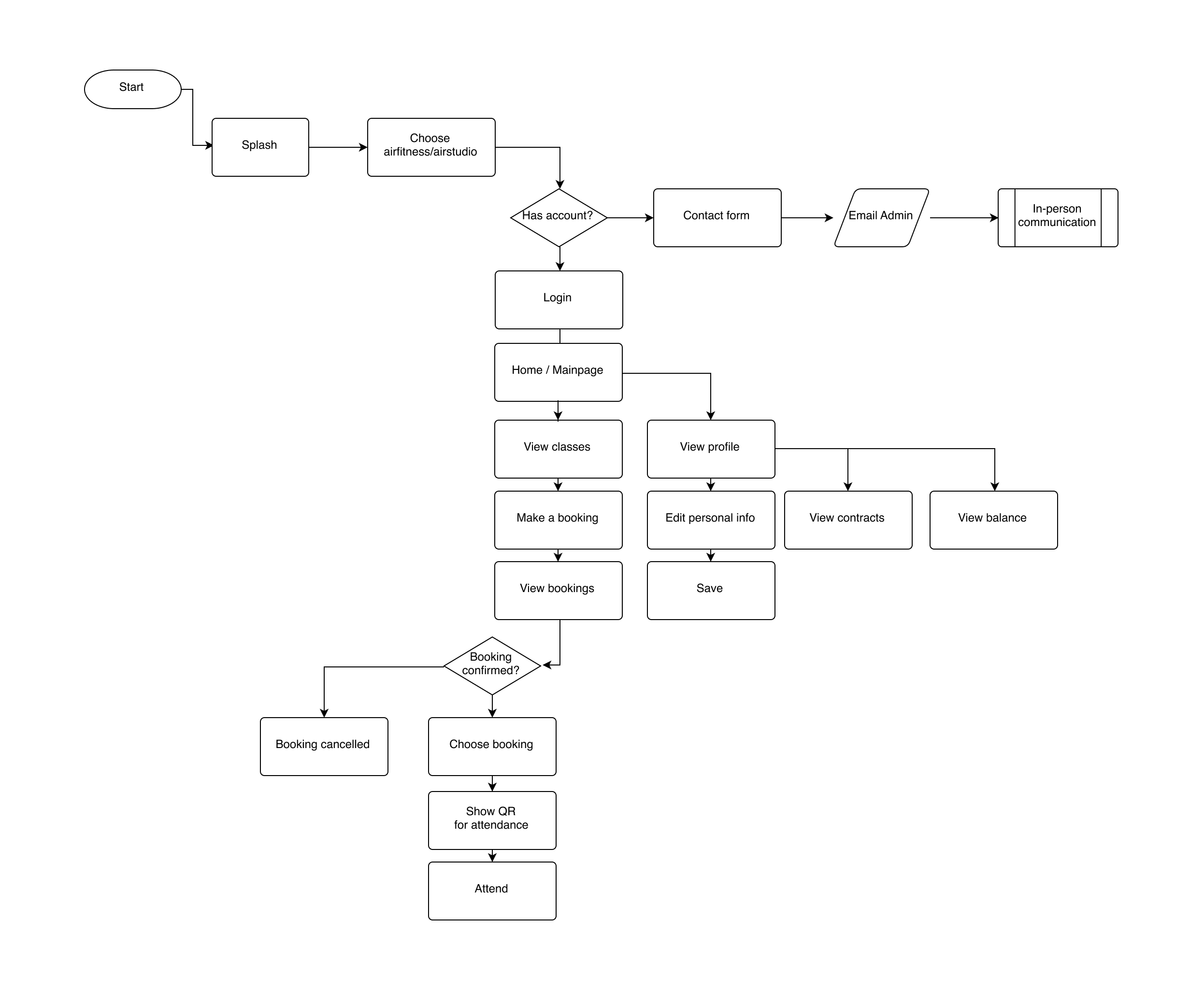
The wider product path around those rules: brand choice, guest vs member, then book, manage, check in.
That map collapses into a single lookup table, which is what the class card component actually implements. Every row below is a real variant in the library — not a special case drawn on one screen.
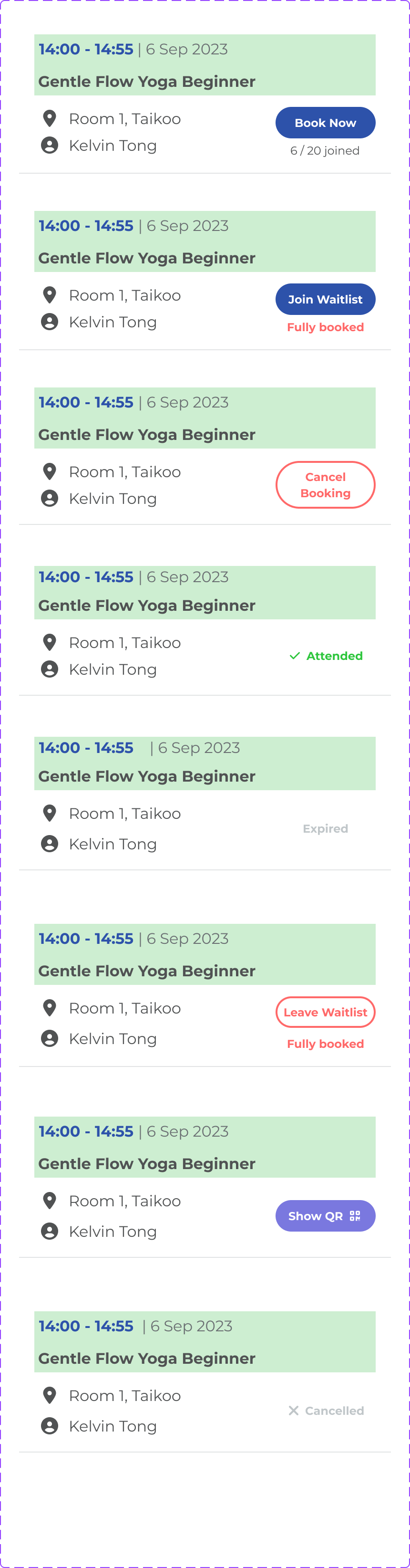
The class card in every legal state: Book Now, Join waitlist, Cancel, Show QR, Attended, Expired, Leave waitlist, Cancelled.
| Not booked, space available | Book Now |
| Not booked, class full | Join waitlist |
| On the waitlist | Leave waitlist |
| Booked, more than 60 minutes before start | Cancel Booking |
| Booked, less than 60 minutes before start | Show QR |
| Scanned at the gym | Attended |
| Never scanned | Expired |
| Cancelled | Cancelled — no action |
The 60-minute cutoff is the one rule that is doing real work. Before it, cancelling is free and the seat goes back to the waitlist while someone can still act on it. After it, cancelling stops being offered at all and the card flips to the QR code — because at that point the only useful thing the app can do is get the member through the door. The same rule protects the gym's occupancy and removes the member's decision, which is exactly the trade a busy person wants.
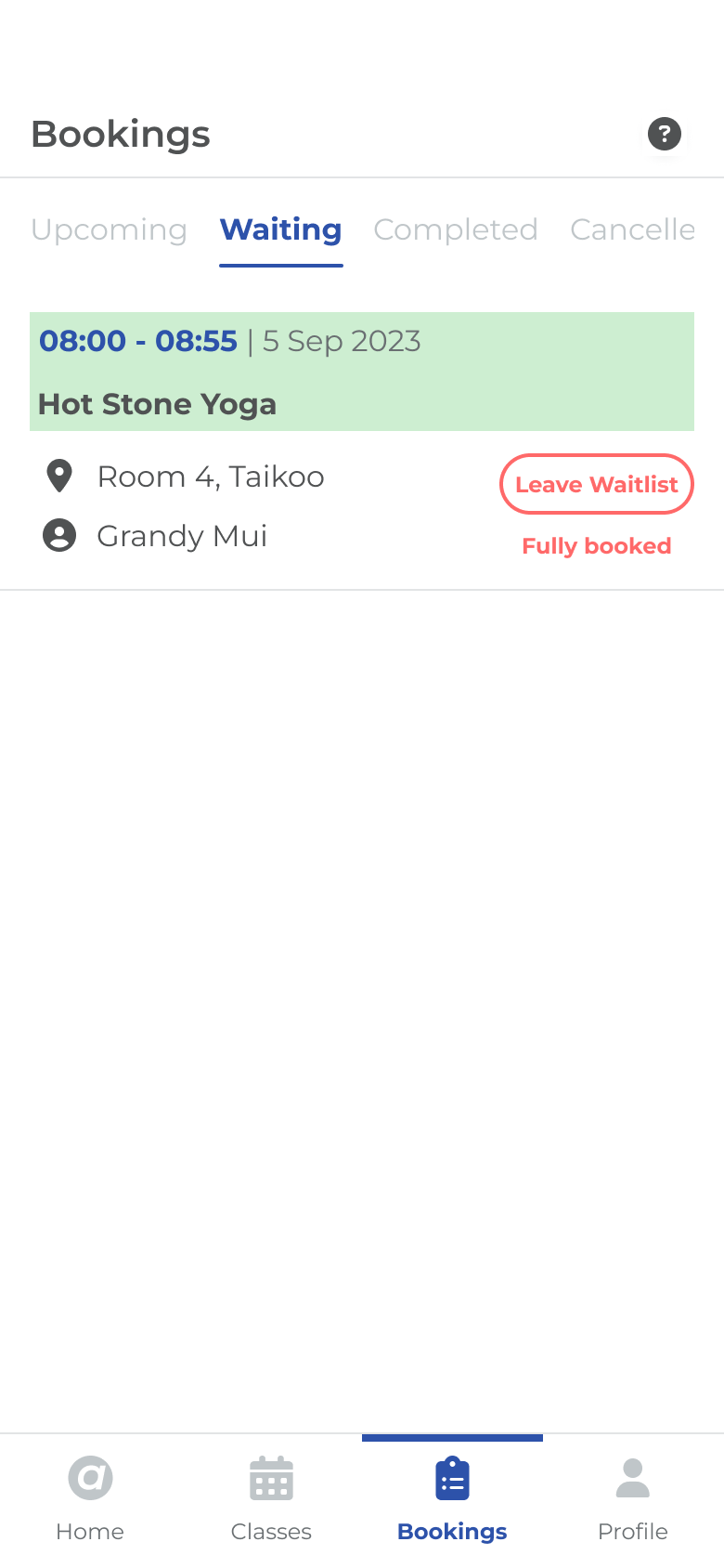
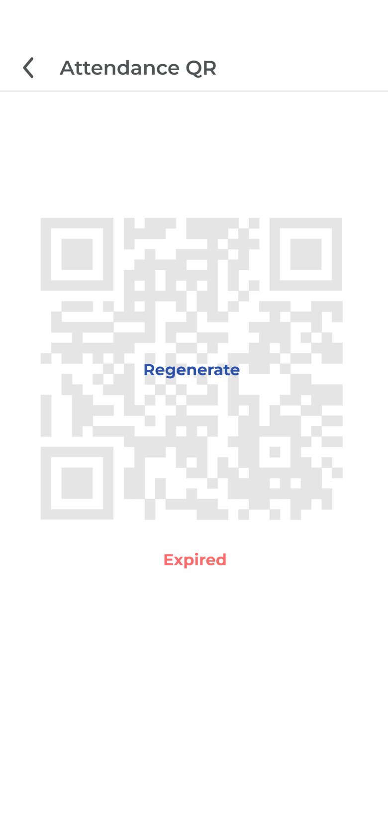
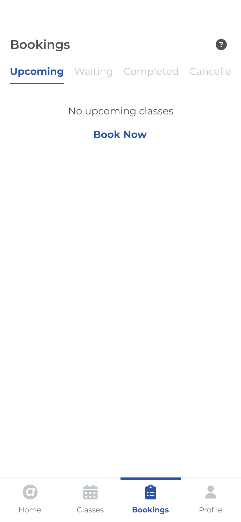
The same rules on real screens: waiting, checking in, and the empty state that sends you back to book.
Check-in is a QR scan at reception, which introduced a constraint from the operations side: the scanning device has to be signed in as an admin account, so the member's phone displays the code and the gym's device reads it, never the other way round. And because a timetable is a living thing, any change to a class's time, location or trainer pushes a notification rather than waiting to be discovered.
Version 1.0's tab bar was Home, Classes, Booking, Profile, More. It was a faithful map of the system behind it, and that was the problem — it was organised around the gym's objects rather than the member's intent.
Two tabs were not earning their place. “Classes” and “Booking” describe the same act to a member who just wants to be in a room on Tuesday evening, and “More” had quietly become a drawer for everything without a home: branches, feedback, language, legal, logout. Meanwhile the two things the persona actually asked for — reminders, and a fast way through a busy timetable — had no permanent surface at all.
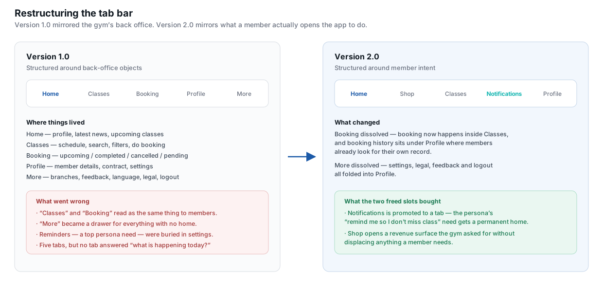
Version 1.0 to 2.0: dissolving two tabs to promote the ones the persona was asking for.
Version 2.0 tried Notifications and Shop as tabs. That was the right pressure test — reminders deserved a surface, and the business wanted a commercial one. Living with that IA made the next cut obvious.
Version 3.0 is the product that shipped: Home, Classes, Bookings, Profile. Bookings came back as its own tab because managing a commitment is a different job from discovering a class. Notifications moved onto Home, behind the bell, which is where a squeezed member already looks at the start of the day. Shop did not survive — it was a business wish, not a member job, and four tabs is the budget a thumb can keep.
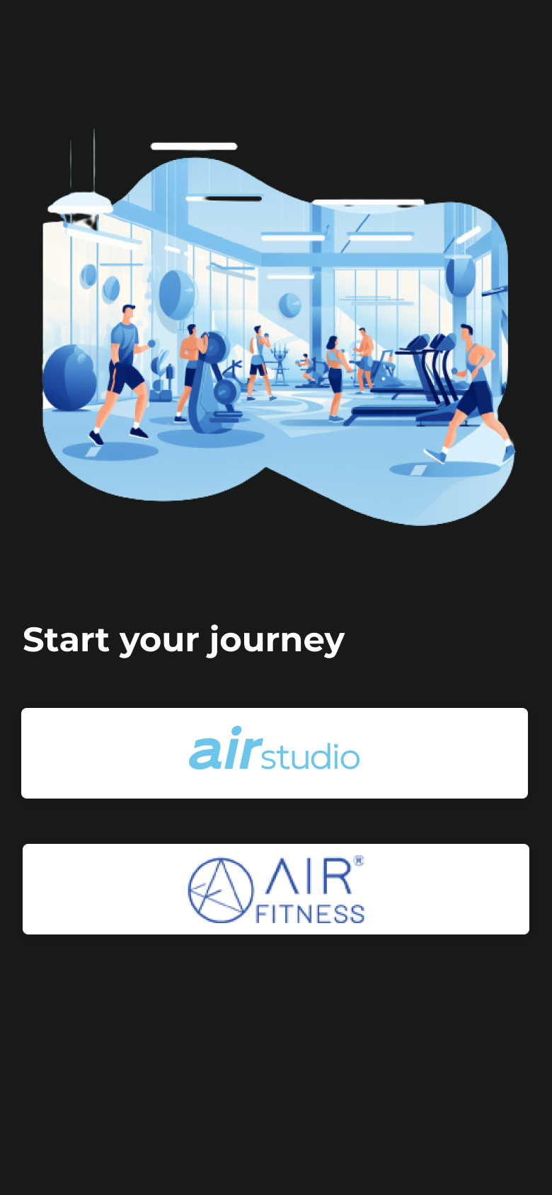
The group runs two brands, so the app opens on a decision the identity has to make painless. A shared splash resolves into “Start your journey” with two doors: airstudio and airfitness.
Holding air constant and varying only the suffix makes the choice a member is being asked to make legible in a single glance.
The palette is a single confident blue carried across both brands, so a member who switches never feels like they have left the product.
The screens are assembled from a component library rather than drawn one by one: buttons, inputs, navigation and tab bars, class cards, calendars, filters, accordions, radios, toggles, loaders and top bars, each with its states defined.
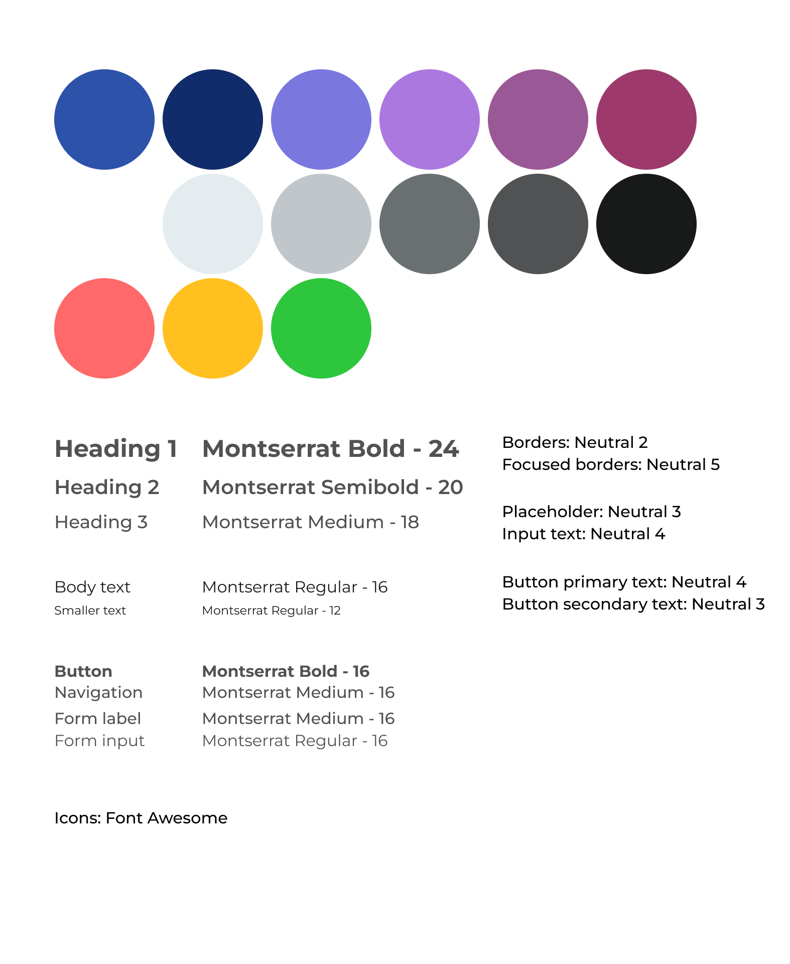
Colour, type and token notes — Montserrat, one blue, a small set of neutrals and status colours.
Building the library first is what made the version 2.0 and 3.0 restructures affordable. Rearranging the navigation was a change to where components sit, not a redraw of every screen — which is the only reason a change that large was worth making at all. The class card's eight states are the same component; only the property changes.
- Write the rules before the screens
Mapping booking as states and transitions before opening a canvas meant the class card had exactly one job: read the state, show the one action that is valid. Almost every ambiguity that would have surfaced late in design surfaced instead as a question in the flow, where it was cheap to answer.
- Treat the persona as a constraint, not a poster
The two lines that mattered — reminders, and variety across the day — are why notifications live on Home and why the timetable filters by time. Without going back to the persona I would have left both as buried preferences, which is where version 1.0 had put them.
- Test the navigation before rebuilding it
The version 1.0 to 3.0 path was argued from first principles and the shipped IA holds up, but it was a judgement call. A card sort or a first-click test with a handful of members would have cost very little and would have either confirmed the change or caught Shop before a full set of screens was built around it.
- Validate the 60-minute cutoff against real data
Sixty minutes is a reasonable number, not a measured one. The right value depends on how late waitlisted members realistically arrive, and that is knowable from booking records. It is the first thing I would instrument after launch.
- Design the empty and failure states earlier
A no-network QR screen, a waitlist that never clears, a cancelled class — these are the moments where a booking app either keeps or loses trust. The empty bookings state made it into the library; the failure states still came after the happy path rather than alongside it.
'%3e%3cstop%20offset='0'%20stop-color='%23E07A5F'/%3e%3cstop%20offset='1'%20stop-color='%23B84A2E'/%3e%3c/linearGradient%3e%3c/defs%3e%3cg%3e%3c!--%20Bottom%20wing%20--%3e%3cpath%20fill='url(%23wing-bottom)'%20d='M417.58,760.351c0,-0%20-0.483,290.863%20-0.746,449.566c-0.045,26.601%2010.512,52.123%2029.333,70.921c18.822,18.798%2044.358,29.322%2070.959,29.245c195.963,-0.603%20619.277,-1.867%20724.362,-1.867c3.826,-0%207.181,-2.745%208.202,-6.71c1.022,-3.965%20-0.543,-8.175%20-3.823,-10.292c-143.543,-92.615%20-828.287,-530.863%20-828.287,-530.863Z'/%3e%3c!--%20Top%20wing%20--%3e%3cpath%20fill='url(%23wing-top)'%20d='M417.58,883.378c0,-0%20-0.483,-290.863%20-0.746,-449.566c-0.045,-26.601%2010.512,-52.124%2029.333,-70.922c18.822,-18.798%2044.358,-29.322%2070.959,-29.244c195.963,0.603%20619.277,1.867%20724.362,1.867c3.826,-0%207.181,2.745%208.202,6.71c1.022,3.964%20-0.543,8.175%20-3.823,10.291c-143.543,92.616%20-828.287,530.864%20-828.287,530.864Z'/%3e%3c!--%20Center%20mark%20--%3e%3cpath%20fill='url(%23center)'%20d='M736.057,846.967c-4.439,-3.121%20-7.08,-8.207%20-7.08,-13.634c-0,-5.426%202.641,-10.512%207.08,-13.633c81.272,-57.145%20394.563,-277.428%20487.69,-342.908c5.089,-3.578%2011.747,-4.024%2017.268,-1.157c5.52,2.867%208.985,8.57%208.985,14.791c-0,122.907%20-0,562.908%20-0,685.814c-0,6.221%20-3.465,11.924%20-8.985,14.791c-5.521,2.868%20-12.179,2.421%20-17.268,-1.157c-93.127,-65.48%20-406.418,-285.763%20-487.69,-342.907Z'/%3e%3c/g%3e%3c/svg%3e)
张菱真 © 2020-2026
经过无数设计更改、与bug交战、修改句子等挫折后完成
